Girl with a MirrorGirl with a Mirror
Concept
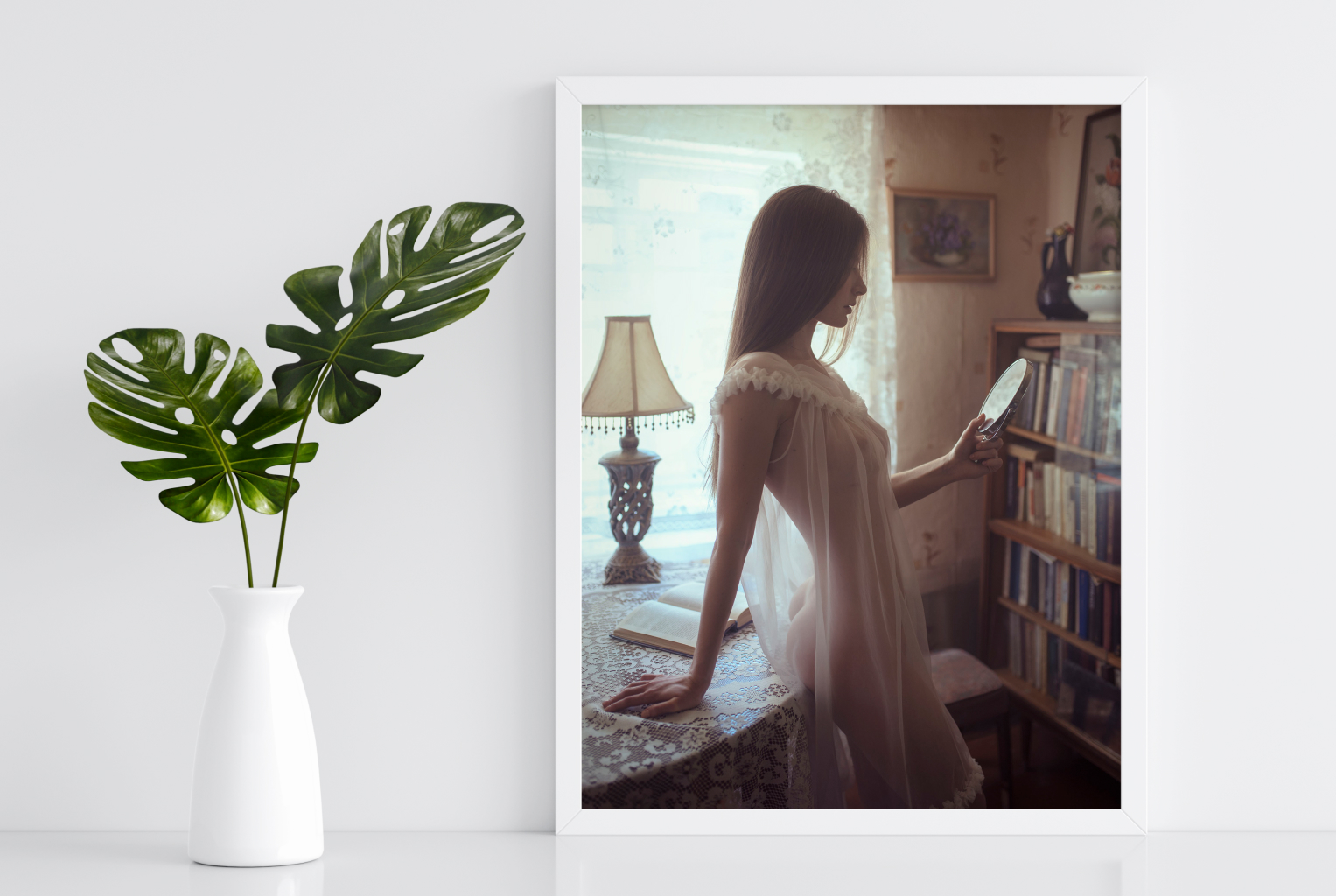
A girl in an old apartment, dressed in a transparent nightgown, enjoys her reflection in a small mirror. The goal is to show the beauty and fragility of a subtle girl's body through the transparent fabric.
Inspiration
A girl looking in the mirror is one of the most prevalent themes in art, and I wanted to express my interpretation of this concept. An old Soviet apartment was chosen as the location for this photoshoot.
Choice of color
Like in most of my photos, I'd like to show the 1970s and 1980s. The room is quite dark, with only one window providing light. Brown and yellow are the most common colors in the location, and I decided to focus on shades of red. Also, to avoid monochrome and boringness, make the photo's light areas (window, fabric, mirror, etc.) a different color, such as blue or greenish.
Wardrobe
I wanted to show the girl's thin, perfect figure, not completely naked. I bought a long, lightweight dress with transparent outer fabric and an opaque lining for these purposes. Later, the lining was removed to create an airy, fully transparent dress/nightgown.

Background
To the girl’s left and behind her are parts of an old apartment, a table with a lace tablecloth, a bookcase, a vintage table lamp, etc. A lace curtain also hangs on the window, enhancing the retro atmosphere. I chose a location with a window behind the model to show the contour of the girls' lines against the light background. Thanks to the light and dark areas of the photo make it even thinner and more graceful.

Hair and make-up
The make-up is light and natural. The face is visible only in the profile, and the make-up is almost absent.
Light
Backlight from a window reflector illumination. As a result, the girl appears as a dark outline, but her body lines and breast are visible. In this case, it's the best outcome. If you use additional lightings, such as a lamp or flash, the girl will be too lit, simplifying the photo.
Posing
I wanted to highlight the model's subtle and graceful figure. To achieve this effect, I turned the model sideways, her hips were in contact with the table, and she was slightly turned towards the camera. In this pose, all beauty is visible in the frame. Because the model has beautiful lines, the face is shot in profile. The posture was natural and relaxed. She held a mirror with one hand and leaned on the table with the other; simultaneously, the model looked at her reflection. In this pose, both hands are visible, and the body is beautiful and graceful.

Camera and optics
Nikon D750 Sigma 35 1.4 Art. 1/100, f1.8, ISO 320
Depth of field
In case the background objects are close enough to the model, I chose an aperture of 1.8 to create a slight blur, directing the viewer's attention to the model. If the background is too sharp, the books will stand out too much, and the background will simply "ripple." If you open the diaphragm fully, by 1.4, the books in the closet will be too blurry, and many exciting details will be lost. Moreover, at a fully open aperture, there is a high likelihood of visible chromatic aberrations in areas where light from a window and dark interior details such as a table lamp combined.
Angle
The angle (shooting point) is essential in this photo and was chosen through experimentation. One of the photo's "highlights" is the girl's hips, and it was important to show them while maintaining the overall composition and perspective. If you move the camera to the left, the girl's face will come in contact with the picture on the wall, and her profile will not be seen. If you move to the right, there will be too many windows in the frame, but the bookcase will be hidden, and the stunning element of the interior will disappear from the frame. Whether you lower the camera, only one hip is visible, which makes the photo more primitive. So, you can raise the camera a little higher.
Cropping
It is done around the model to include the girl and a part of the interior. The model's legs below the dress were not shown in the frame because they would have revealed too much of her figure. It was possible to capture more space around the girl, but it was unnecessary. If cropping is too close to the model, there won't be enough space on the sides.

Expression
The photo is very calm and harmonious. A lovely young nymph enjoys looking in the mirror, and she knows how beautiful she is. This emotion I wanted to see in the photo.
Post-processing
Processing is done in warm colors, with a "film" effect. No bright or high contrast areas. I removed excessive sharpness and added a slight "soft" effect.
Concept
A girl in an old apartment, dressed in a transparent nightgown, enjoys her reflection in a small mirror. The goal is to show the beauty and fragility of a subtle girl's body through the transparent fabric.
Inspiration
A girl looking in the mirror is one of the most prevalent themes in art, and I wanted to express my interpretation of this concept. An old Soviet apartment was chosen as the location for this photoshoot.
Choice of color
Like in most of my photos, I'd like to show the 1970s and 1980s. The room is quite dark, with only one window providing light. Brown and yellow are the most common colors in the location, and I decided to focus on shades of red. Also, to avoid monochrome and boringness, make the photo's light areas (window, fabric, mirror, etc.) a different color, such as blue or greenish.
Wardrobe
I wanted to show the girl's thin, perfect figure, not completely naked. I bought a long, lightweight dress with transparent outer fabric and an opaque lining for these purposes. Later, the lining was removed to create an airy, fully transparent dress/nightgown.

Background
To the girl’s left and behind her are parts of an old apartment, a table with a lace tablecloth, a bookcase, a vintage table lamp, etc. A lace curtain also hangs on the window, enhancing the retro atmosphere. I chose a location with a window behind the model to show the contour of the girls' lines against the light background. Thanks to the light and dark areas of the photo make it even thinner and more graceful.

Hair and make-up
The make-up is light and natural. The face is visible only in the profile, and the make-up is almost absent.
Light
Backlight from a window reflector illumination. As a result, the girl appears as a dark outline, but her body lines and breast are visible. In this case, it's the best outcome. If you use additional lightings, such as a lamp or flash, the girl will be too lit, simplifying the photo.
Posing
I wanted to highlight the model's subtle and graceful figure. To achieve this effect, I turned the model sideways, her hips were in contact with the table, and she was slightly turned towards the camera. In this pose, all beauty is visible in the frame. Because the model has beautiful lines, the face is shot in profile. The posture was natural and relaxed. She held a mirror with one hand and leaned on the table with the other; simultaneously, the model looked at her reflection. In this pose, both hands are visible, and the body is beautiful and graceful.

Camera and optics
Nikon D750 Sigma 35 1.4 Art. 1/100, f1.8, ISO 320
Depth of field
In case the background objects are close enough to the model, I chose an aperture of 1.8 to create a slight blur, directing the viewer's attention to the model. If the background is too sharp, the books will stand out too much, and the background will simply "ripple." If you open the diaphragm fully, by 1.4, the books in the closet will be too blurry, and many exciting details will be lost. Moreover, at a fully open aperture, there is a high likelihood of visible chromatic aberrations in areas where light from a window and dark interior details such as a table lamp combined.
Angle
The angle (shooting point) is essential in this photo and was chosen through experimentation. One of the photo's "highlights" is the girl's hips, and it was important to show them while maintaining the overall composition and perspective. If you move the camera to the left, the girl's face will come in contact with the picture on the wall, and her profile will not be seen. If you move to the right, there will be too many windows in the frame, but the bookcase will be hidden, and the stunning element of the interior will disappear from the frame. Whether you lower the camera, only one hip is visible, which makes the photo more primitive. So, you can raise the camera a little higher.
Cropping
It is done around the model to include the girl and a part of the interior. The model's legs below the dress were not shown in the frame because they would have revealed too much of her figure. It was possible to capture more space around the girl, but it was unnecessary. If cropping is too close to the model, there won't be enough space on the sides.

Expression
The photo is very calm and harmonious. A lovely young nymph enjoys looking in the mirror, and she knows how beautiful she is. This emotion I wanted to see in the photo.
Post-processing
Processing is done in warm colors, with a "film" effect. No bright or high contrast areas. I removed excessive sharpness and added a slight "soft" effect.
Artists
Information
All rights for the whole and/or partial: graphic content (photos, videos, illustrations), plots/stories, single text materials, audio files/audio content, corresponding program code, that were used and/or are being used in the mobile application "NYMF" and/or all its original changes, additions, modifications and also on services https://dubnitskiy.com, https://nymf.com are the result of individual creativity and belong to D.I. Dubnitskiy (under the pen name of David Dubnitskiy).
Copyright Notice.
